
Between the Lines
Michael CRAIG-MARTIN / Julian OPIE / Ian DAVENPORT
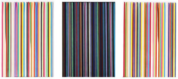
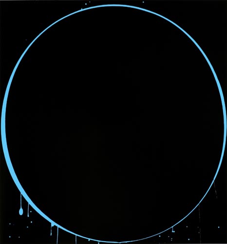
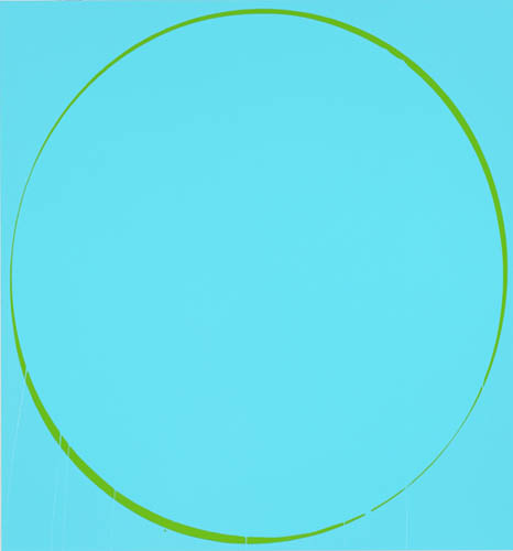
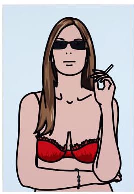
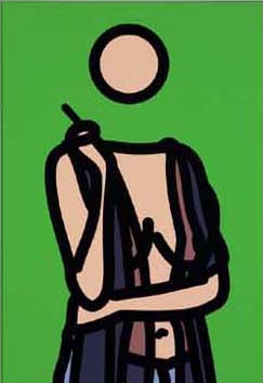
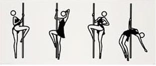
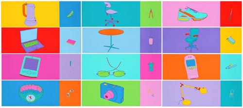
Between the Lines The outlining of familiar shapes is an activity which humankind has been pursuing for some 13,000 years now: the cave paintings at Lascaux, Altamira and elsewhere testify to that. And, according to some historians of the Upper Palaeolithic, it is an act intimately connected with a sense of history, of time passing. Humans began to draw, these experts believe, when our brains became sophisticated enough to permit us a sense of past and future: to recall experiences and project forwards into what we might want (e.g. a successful hunt). Now, it is no easy jump from cave painters to the three sophisticated, wily and erudite London-based artists showcased in this exhibition – the first time these artists, well known in Europe and the US, have been exhibited in Korea. But there is a continuity. Creating lines, we are reminded, remains a vital human activity. We bring the past to bear on it, and we do it to make sense of, and convey the particular feel of, our moment. Our moment is a distinctly technological one, of course, and each of these artists’ practices is strongly inflected by the use of computers or technical processes. For the Dublin-born Michael Craig-Martin, the eldest of these artists by two decades – and also the tutor first of Julian Opie, then of Ian Davenport, at London’s celebrated Goldsmiths’ College of Art – ‘drawing’ once meant making pencil images, then using them as templates for pictures in coloured tape applied directly to gallery walls. Today it means moving a computer mouse over photographic imagery, producing a drawing that is a kind of iconic simplification, and that is then reproducible in a variety of media. Consistent, however, is Craig-Martin’s unruffled, thoughtful approach. He has long worked with representations of everyday objects, reducing them to communicable pictorial essences. And even his turn towards art-historical subject matter, which first occurred in 2000-01 with a sequence of paintings based on Velazquez’ Las Meninas, was initially spurred by an interest in how such elevated images had become, through reproduction, utterly familiar. The set of four screenprints, History 1,2,3,4 (2001), extends Craig-Martin’s art-historical turn, but with a twist. The artist is reflecting on multiple histories: that of his own career, of the common objects he uses, and that of modern art as a whole. Everyday forms he has previously deployed, such as anglepoise lamps, stepladders, drills, and globes, intermingle with iconic forms drawn from the history of modern art: Marcel Duchamp’s bottle-rack readymade, René Magritte’s wineglass, Jasper Johns’ can of paint brushes, and Andy Warhol’s sickle. Craig-Martin’s own work is a latter-day gambit in the modernist tradition of working with, and bestowing surprising significance upon, everyday objects; here, he pointedly inserts his art into this continuum. Employing the disorienting but enticing shifts of scale that have long been one of his trademarks, he sometimes floats his own subjects in the foreground, brightly coloured against a black-and-white background; at other times, reduced to black line, they recede. Either way, the images celebrate a tradition within the last century’s art while presenting it – comically but aptly, since when taken out of the magical gallery context all these objects would return to being everyday matter – as so much clutter in a storeroom. The storeroom, of course, is art history. If the observation is bittersweet, the artist’s patented impersonal style bestows upon it a suggestion of ironical acceptance. The work, for all its surface precision, feels open-ended in terms of what it actually conveys. Craig-Martin has suggested that his thick outlines and saturated, simple colours relate to children’s first reading books and alphabet primers, and that there is a correlation in his work between looking and reading. Art history, it is dryly insinuated in the History quartet, is a language artists must learn (or, a storeroom they must familiarise themselves with) in order to participate in the great conversation, or risk repeating the past. The other series here, the twelve-screenprint set Folio (2004), also has a retrospective feel, and again reflects on both the idea of looking-as-reading, and on how things descend into the familiar. The imagery, in each case isolating a single subject on a candy-coloured background, is of mass-manufactured objects. Half of the prints feature high-end consumer products such as laptops, cameras, watches and designer spectacles, drawn large-scale; these are juxtaposed with much smaller images of everyday objects such as shoes, compasses, commonplace chairs, books, sardine tins, etc. Again, time and changeability are invoked: objects such as a stovetop coffeemaker, once desirable, are now standard. The world mimicked here is one in which desire is stimulated, created – a smooth consumerism echoed in Craig-Martin’s hygienic aesthetic. There are twinges of anxiety in his depiction of it: the presence of a pair of handcuffs, for instance, quietly suggests that one might be shackling oneself by buying into this reality. But Craig-Martin draws from his own collection of bought objects, and so in criticising he must criticise himself and recognize his implication in this system. While foreshadowing this frictionless world through his work, Craig-Martin has arguably done so while pursuing a distinctly conceptual approach to image-making. Julian Opie, by contrast, has devoted his career to finding visual analogies for the increasingly smooth, consumption-driven, soft-capitalist reality so many of us live in. Some of his earlier works, for instance, explored the sealed-off experience of the moving landscape that motorway travel provides, relaying landscapes in a flat graphic style that suggested a computerised driving simulator. But one can also see Opie’s work since as an engagement with genre. How does one produce a portrait, say, in an age like ours which has found signs and euphemisms for everything? Ruth Smoking 1-5 (2006) is one convincing answer. The apparent history of these screenprints is that a photograph has been scanned into a computer, its particularities steadily erased until one is left with outline, flat expanses of colour, dots for eyes – and just enough personality to distinguish ‘Ruth’ from any of the other people Opie has similarly simplified (most famously, the members of the British pop group Blur, some of whom are also alumni of Goldsmiths and whose schematic portraits by Opie adorned their greatest hits album cover). Ruth, though, threatens to cross over into being a ‘type’, and what Opie catches here is our tendency, faced with an everyday rush of information, to stereotype and miss nuance. There is a slow-pulsing vein of melancholy in his work, then, which its bright and sociable appearance would seem to deny. (Or perhaps this is an illusion: for Opie’s work, similarly to Andy Warhol’s, can seem to neutrally mirror one’s view of the world.) If one takes on board this insinuation of understated critique, however, then Ruth with Cigarette (2005-6) might be the same images seen through an utterly depersonalised gaze. The figure here, her head reduced to a featureless floating ball and her body to a thickly lined and standardised outline on a succession of coloured backgrounds, has become no more than a sort of agreed-upon public graphic for a human. (In any case, we have to wonder how much ‘Ruth’ is actually being herself, or, as her stereotypically ‘cool’ poses suggest, is performing like a fashion model, modelling her underwear and bikinis.) It is a faintly chilling vision, yet conversely one that is affirmative in pointing to the continued human desire to make portraits, even when the world around us is erasing our capacities for empathy through smart entertainment and the proliferation of signs, and turning us into jaded voyeurs. (See, for example, This is Shahmoza 1-5 (2006), which resembles a set of instructions for pole dancing.) The attentive facial studies and three-quarter poses of art history sit in the deep background of the Ruth works, just as detailed Impressionist studies of changing light on landscape underpin the blankness of View from my Bedroom Window (2007), a changing animation on a computer screen in which daylight rises and falls on a schematic stretch of countryside. What is entirely gone here, of course, is the painter’s touch and, by extension, their personality. On one level this reflects a kind of pragmatism: Opie wants a deliberately flat quality which might enable the same work to be used in different formats (he has worked with window displays and billboards, among other venues). Again, as with Craig-Martin, there is a certain ambivalence here. For one of the achievements of modernity was to criticise the idea of the gesture, the signs of the artist’s hand, as a symbol of authenticity and feeling; and as such we here have portraiture with none of these issues – and no ‘aura’ either, since Opie’s work is mechanically produced. Yet it goes so far in this direction as to create its opposite: a feeling of yearning for some kind of human touch. In a sense, Opie’s work moves at two speeds. There is the fast, almost cartoon-like surface effect, and the slower release of ideas and insinuations behind it. This is also true of Ian Davenport’s work, which, being based around simple, repeated abstract forms, at first seems quickly consumable. This, however, turns out to be deceptive: considered awhile, Davenport’s art bristles with nuance. Follow the rounded line of each of the six Ovals (2002) screenprints, and what initially looks regular turns out to bulge and tilt, almost as if the inner circle were free-floating within the outer frame. Davenport’s art is one of delayed but satisfying emergence: it takes a while to appreciate the exquisite fine-tuning of his colour harmonies, his play with variations of surface texture, his staged tensions between orderly geometry and the free motion of paint. To make these prints, Davenport adapted his painting style, which involves pouring paint onto a flat canvas, lifting it, and turning and angling the canvas to get the shape he wants, to pouring onto glass, building the image up in layers. “The meaning and the painting process are so closely intertwined in my work,” Davenport has said. However beautiful and delicate his art may be, it is bound up with process: it’s not intended to refer to any world outside itself. Nor does one need it to: their slow-revealed subtleties belie any idea their straightforward patterning may suggest that these paintings are easily exhausted in viewing them. Davenport often seems to be looking for the motif that will allow for both richness and simplicity: his Etched Lines (2006) works, which originated in a 50m-long public commission for a railway bridge in Southwark, London, showcase one of his most attractive solutions thus far. The paint’s pooling and mingling at the base of the images once again alerts one to how the work was made: through the assistance of gravity. The viewer can think of it in material terms only for a while, though, before the elevating effects of colour overwhelm them. It is this movement between the clear evidence of how they were made, stripped of illusions or pretensions to metaphysical uplift, and the unearthly beauty of the results, which makes Davenport’s work so captivating. Again, this is work that looks backwards and forwards simultaneously. Davenport, in considering what shape abstract painting might now take, is clearly inspired by the hard-edge abstraction of 1960s America, though he seems to give their work a somewhat colder slant: in a procedure that feels almost industrial, he produces variations, if exquisite ones. Another powerful influence on his works, he says, are the Florentine frescoes of Ghirlandaio, Masaccio and Fra Angelico, particularly their matte surfaces, colours, and relationship to environment. It is in this mixture of the unromantic, the aesthetic and the environmental that Davenport seems to be pushing painting forward. For, like Opie, he is at ease with the idea of art infiltrating the public sphere. And like Opie and Craig-Martin, he also recognises something else. Namely, that to make any line in the name of art is to work in a longstanding tradition – and that outward accessibility can be a doorway to a world of sly argument and marvellously fine distinctions. Martin Herbert